You can easily increase the size of the Radio Button and Checkbox icons in Alchemer surveys so that they are easier for your survey respondents to select. An added benefit is that it is now easy to customize your icons to use cool things like or or even !
If you want to use images as your answer options instead of replacing the icons, visit the Use Images as Answer Options tutorial.
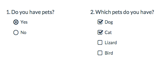
Below we'll cover a couple of style tricks using a little bit of CSS code to make some pretty awesome changes to your survey's radio button and checkbox icons. To use any of the below options simply go to the Style tab and scroll to the bottom of the survey preview. Click the HTML/CSS Editor link. Copy and paste the CSS code for the below icon customization you wish to use in the field on the Custom CSS tab!
For many of these customizations, you can use a color picker like this one to insert a hex code: www.colorpicker.com
Please note the below icon customizations use custom CSS that does not work on mobile devices.
Make Icons Larger
Go to the Style tab and scroll to the bottom of the survey preview. Click the HTML/CSS Editor link. Copy and paste the below CSS code in the field on the Custom CSS tab!
Under Layout > Layout Options tab, make sure the option to Use Default Browser Icons for Radio Buttons and Checkboxes is unchecked.
This will apply to all questions that use either a radio button or a checkbox icon. This includes Radio Button, Radio Button Grid, Checkboxes, Checkbox Grid, Ranking Grid, Rating (Likert Scale) and Net Promoter Score®.
.sg-replace-icons input[type=radio] + label:before,
.sg-replace-icons input[type=radio] + label span.sg-icon-target:before,
.sg-replace-icons input[type=checkbox] + label:before,
.sg-replace-icons input[type=checkbox] + label span.sg-icon-target:before
{
 /* Default font size */
 /* font-size:1.3em; */

 /* Larger font size */
 font-size: 25px;
}
Change the icon color when selected
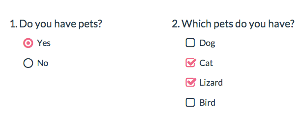
Go to the Style tab and scroll to the bottom of the survey preview. Click the HTML/CSS Editor link. Copy and paste the below CSS code in the field on the Custom CSS tab. Then, simply replace the hex color code #F06586 with whichever color you want.
Under Layout > Layout Options tab, make sure the option to Use Default Browser Icons for Radio Buttons and Checkboxes is unchecked.
This will apply to all questions that use either a radio button or a checkbox icon. This includes Radio Button, Radio Button Grid, Checkboxes, Checkbox Grid, Ranking Grid, Rating (Likert Scale) and Net Promoter Score.
.sg-replace-icons input[type=radio]:checked + label:before,
.sg-replace-icons input[type=radio]:checked + label span.sg-icon-target:before,
.sg-replace-icons input[type=checkbox].sg-input-checkbox:checked + label:before,
.sg-replace-icons input[type=checkbox].sg-input-checkbox:checked + label span.sg-icon-target:before
{
 color:#F06586;
}
Change the icon and label color when selected
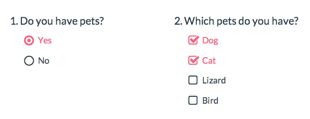
Go to the Style tab and scroll to the bottom of the survey preview. Click the HTML/CSS Editor link. Copy and paste the below CSS code in the field on the Custom CSS tab. Then, simply replace the hex color code #F06586 with whichever color you want.
Under Layout > Layout Options tab, make sure the option to Use Default Browser Icons for Radio Buttons and Checkboxes is unchecked.
This will apply to all questions that use either a radio button or a checkbox icon. This includes Radio Button, Radio Button Grid, Checkboxes, Checkbox Grid, Ranking Grid and Net Promoter Score. (Note: Won't work with horizontal radio buttons or rating (Likert scale) questions.
.sg-replace-icons input[type=radio]:checked + label,
.sg-replace-icons input[type=checkbox].sg-input-checkbox:checked + label{
 color:#F06586;
}
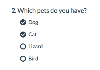
Change checkbox icons to use circle icons
.sg-replace-icons input[type=checkbox].sg-input-checkbox + label:before,
.sg-replace-icons input[type=checkbox].sg-input-checkbox + label span.sg-icon-target:before
{
/* unchecked checkbox */
/* content: "\f096"; - Default icon */
 content: "\25cb";
}
.sg-replace-icons input[type=checkbox].sg-input-checkbox:checked + label:before,
.sg-replace-icons input[type=checkbox].sg-input-checkbox:checked + label span.sg-icon-target:before
{
/* checked checkbox */
/* content: "\f046"; - Default icon */
 content: "\f058";
}
Learn more about other available icons
Change radio buttons to hearts
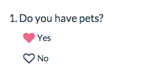
Go to the Style tab and scroll to the bottom of the survey preview. Click the HTML/CSS Editor link. Copy and paste the below CSS code in the field on the Custom CSS tab. Then, simply replace the hex color code #F06586 with whichever color you want.
Under Layout > Layout Options tab, make sure the option to Use Default Browser Icons for Radio Buttons and Checkboxes is unchecked.
This will apply to all questions that use a radio button icon. This includes Radio Button, Radio Button Grid, Ranking Grid, Rating (Likert Scale) and Net Promoter Score.
.sg-replace-icons input[type=radio] + label:before,
.sg-replace-icons input[type=radio] + label span.sg-icon-target:before
{
/* unselected radio */
/* content: "\f10c"; - Default icon */
 content: "\2661";
}
.sg-replace-icons input[type=radio]:checked + label:before,
.sg-replace-icons input[type=radio]:checked + label span.sg-icon-target:before
{
/* selected radio */
/* content: "\f192"; - Default icon */
 content: "\2665";
 color: #F06586;
}
Learn more about other available icons
Change icons for a single question
If you wish to change the icons for a single question in the survey you will need to add the ID of the question to the CSS as below. Learn how to find IDs.
.sg-replace-icons #sgE-2179254-1-2-box input[type=radio] + label:before,
.sg-replace-icons #sgE-2179254-1-2-box input[type=radio] + label span.sg-icon-target:before
{
/* unselected radio */
/* content: "\f111"; - Default icon */
content: "\f111";
}

.sg-replace-icons #sgE-2179254-1-2-box input[type=radio]:checked + label:before,
.sg-replace-icons #sgE-2179254-1-2-box input[type=radio]:checked + label span.sg-icon-target:before
{
/* selected radio */
/* content: "\f058"; - Default icon */
content: "\f058";
}
Use default browser icons
These icons will be on by default in all new surveys created on October 1, 2014, or later. If you wish to override these awesome icons and use the browser defaults, you can do so under Style > Layout > Layout Options. Simply check the option to Use Default Browser Icons for Radio Buttons and Checkboxes.
Using other icons
We have additional icons available for your use (ex. smiley faces). Check out the library of available icons to use in your surveys.
To use, copy the four-digit alpha-numeric code for the icon you wish to use.
The above examples where we replace the icon for all questions with radio buttons or all with checkbox questions is the easiest way to take advantage of these awesome icons. If you are familiar with CSS, there are other really nifty customizations you can make. For example, you could change a five-optionRating (Likert scale) to use emoticon-like smiley faces and different colors when selected.

Check it out in this survey:
http://survey.alchemer.com/s3/1819670/Emoticons
Go to the Style tab and scroll to the bottom of the survey preview. Click the HTML/CSS Editor link. Copy and paste the below CSS code in the field on the Custom CSS tab.
Under Layout > Layout Options tab, make sure the option to Use Default Browser Icons for Radio Buttons and Checkboxes is unchecked.
Note, this will apply to all Rating (Likert Scale) questions in your survey.
/* Option 1 */ .sg-replace-icons .sg-rating-scale .sg-cell-1 input[type=radio] + label:before, .sg-replace-icons .sg-rating-scale .sg-cell-1 input[type=radio] + label span.sg-icon-target:before{ /* Angry */ content: "\1f620"; } .sg-replace-icons .sg-rating-scale .sg-cell-1 input[type=radio]:checked + label:before, .sg-replace-icons .sg-rating-scale .sg-cell-1 input[type=radio]:checked + label span.sg-icon-target:before{ /* Angry Selected */ content: "\e609"; color: #D84A65; } /* Option 2 */ .sg-replace-icons .sg-rating-scale .sg-cell-2 input[type=radio] + label:before, .sg-replace-icons .sg-rating-scale .sg-cell-2 input[type=radio] + label span.sg-icon-target:before{ /* Sad */ content: "\2639"; } .sg-replace-icons .sg-rating-scale .sg-cell-2 input[type=radio]:checked + label:before, .sg-replace-icons .sg-rating-scale .sg-cell-2 input[type=radio]:checked + label span.sg-icon-target:before{ /* Sad Selected */ content: "\e605"; color: #F3849E; } /* Option 3 */ .sg-replace-icons .sg-rating-scale .sg-cell-3 input[type=radio] + label:before, .sg-replace-icons .sg-rating-scale .sg-cell-3 input[type=radio] + label span.sg-icon-target:before{ /* Meh */ content: "\1f610"; } .sg-replace-icons .sg-rating-scale .sg-cell-3 input[type=radio]:checked + label:before, .sg-replace-icons .sg-rating-scale .sg-cell-3 input[type=radio]:checked + label span.sg-icon-target:before{ /* Meh Selected */ content: "\e60b"; color: #40A2C1; } /* Option 4 */ .sg-replace-icons .sg-rating-scale .sg-cell-4 input[type=radio] + label:before, .sg-replace-icons .sg-rating-scale .sg-cell-4 input[type=radio] + label span.sg-icon-target:before{ /* Good */ content: "\263a"; } .sg-replace-icons .sg-rating-scale .sg-cell-4 input[type=radio]:checked + label:before, .sg-replace-icons .sg-rating-scale .sg-cell-4 input[type=radio]:checked + label span.sg-icon-target:before{ /* Good Selected */ content: "\e603"; color: #AFD65C; } /* Option 5 */ .sg-replace-icons .sg-rating-scale .sg-cell-5 input[type=radio] + label:before, .sg-replace-icons .sg-rating-scale .sg-cell-5 input[type=radio] + label span.sg-icon-target:before{ /* Happy */ content: "\1f601"; } .sg-replace-icons .sg-rating-scale .sg-cell-5 input[type=radio]:checked + label:before, .sg-replace-icons .sg-rating-scale .sg-cell-5 input[type=radio]:checked + label span.sg-icon-target:before{ /* Happy Selected */ content: "\e607"; color: #77A60F; }
Note: If you would like to hide the text associated with the Rating (Likert Scare) questions (i.e. Satisfied, Dissatisfied, etc.), you can do so by utilizing the following piece of code. This will apply to all Rating (Likert Scale) questions in your survey.
.sg-rating-scale table thead tr{
 display:none;
}
Net Promoter®, NPS®, NPS Prism®, and the NPS-related emoticons are registered trademarks of Bain & Company, Inc., Satmetrix Systems, Inc., and Fred Reichheld. Net Promoter Score℠ and Net Promoter System℠ are service marks of Bain & Company, Inc., Satmetrix Systems, Inc., and Fred Reichheld.